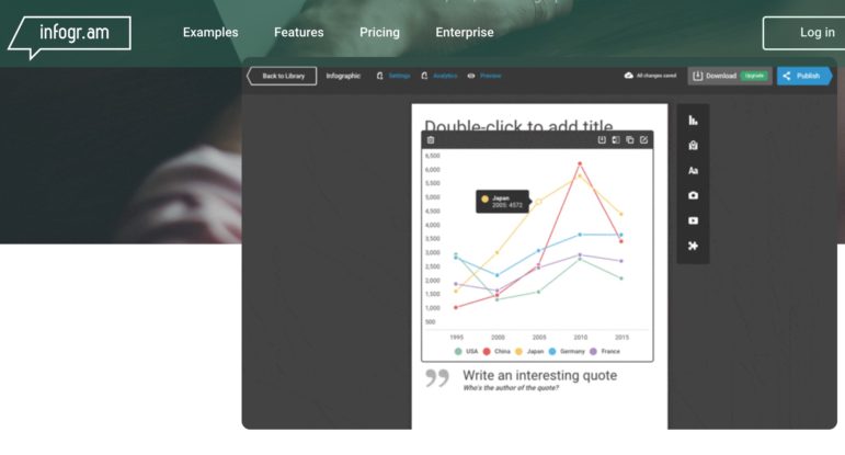
Infogram is a tool data journalist Sanjit Oberai recommends to make data shareable on Twitter and Instagram. Screenshot of Infogram’s website.
What good is a beautifully reported data story nobody sees? Get more eyeballs on your work by taking advantage of platforms designed to visualize and share data on social media.
At Uncovering Asia 2016 in Nepal, data pros shared tips and their favorite tricks.
Format Data Correctly
Sandhya Kambhampati of the German non-profit investigative newsroom CORRECT!V said when inputting data on Excel spreadsheets, journalists should use the correct format, which means:
- Don’t combine numbers and text
- Don’t use comments or colors
- Don’t leave blank rows for spacing
Keep a “data dictionary,” or a document that explains what the data describes and the format, and a separate “data diary” to track your work, Kambhampati said.
“Keep track of every single thing you do. If you add a row or delete a row, write that down. So that when you go away on a weekend, and you don’t remember what you did, you won’t have to repeat the work to figure it out.”
Kambhampati’s presentation is accessible here.
Use VLOOKUP
Nils Mulvad of Investigative Reporting Denmark suggested journalists master one an Excel function called VLOOKUP, which allows users to join content from two or more Excel worksheets.
“It’s a really handy tool,” Mulvad said.
Here is Mulvad’s presentation.

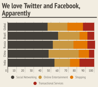
Example of graphic Oberai made using Infogram, illustrating India’s Internet habits. Source: https://infogr.am/4-charts-that-explain-indias-internet-habits
Make Catchy Graphics
Sanjit Oberai, data editor of Indian financial website Moneycontrol, recommended the software Infogram to make data easy to share on Twitter and Instagram. It allows data journalists to present data through graphs and charts designed for social media.
“What’s interesting about Infogram are the new features. You can download charts as GIFs and use them on Twitter. It makes data more fun and gets more social media engagements. It worked well for us,” he said.
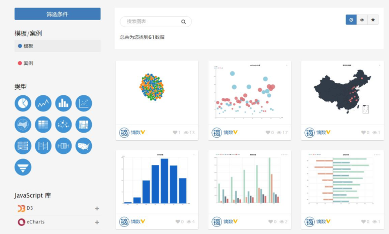
In China, the Dyclub Data Media Lab at Wuhan University is creating a similar platform that will allow Chinese media organizations to store data and use visualization templates, said Qing Tian of the Media Lab. The project, called dydatas, will be launched in October and is aimed at helping journalists with no data skills design a graphic.
“We want to have more economics-related data in China and to use a lot of graphics so readers can understand the information easily,” she said.

Dydatas is a data visualization tool that the Wuhan University Dyclub Data Media Lab is planning in China. Slide from Qing Tian’s presentation.
PDF Extraction Tools
With government agencies and companies releasing more data in PDF format, Mulvad and Oberai suggest several PDF extraction tools. Tabula, Cometdocs, and iLovePDF are their top picks.
Moderator Mark Horvit, executive director of Investigative Reporters & Editors, suggested journalists should back up their data before using extracting tools.
“Do data integrity checks. All tools are great and save you a lot of time, but go back and make sure there are no problems,” Horvit said.
 Ayee Macaraig is a Manila-based journalist covering politics and international affairs. She reported on this event as part of the IACC Young Journalists Initiative, a network reporting on corruption around the globe.
